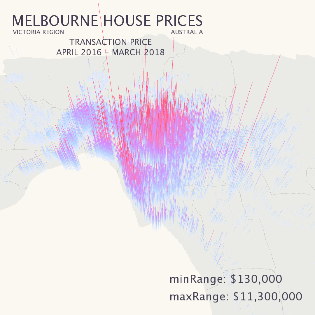
Melbourne Real Estate is an interactive data visualisation project that shows the house price changes from 2016 to 2018. All the real data of house prices from Real Estate are converted from abstract numbers to concrete graphics. Users can choose the price range from the draggable bar on the top right corner. The map shows the price range graphic automatically based on the users’ choices. It is easy to understand the graphic; the red color represents the higher price and the blue represents the lower price. Detailed geographic information is provided if the user hovers on any area of the map.

data visulisation, interactive,
website design
House Price Data Visualisation
![[x]](/_nuxt/img/MH_web_01.2a61b3e.jpg)
Design Concept
Version II
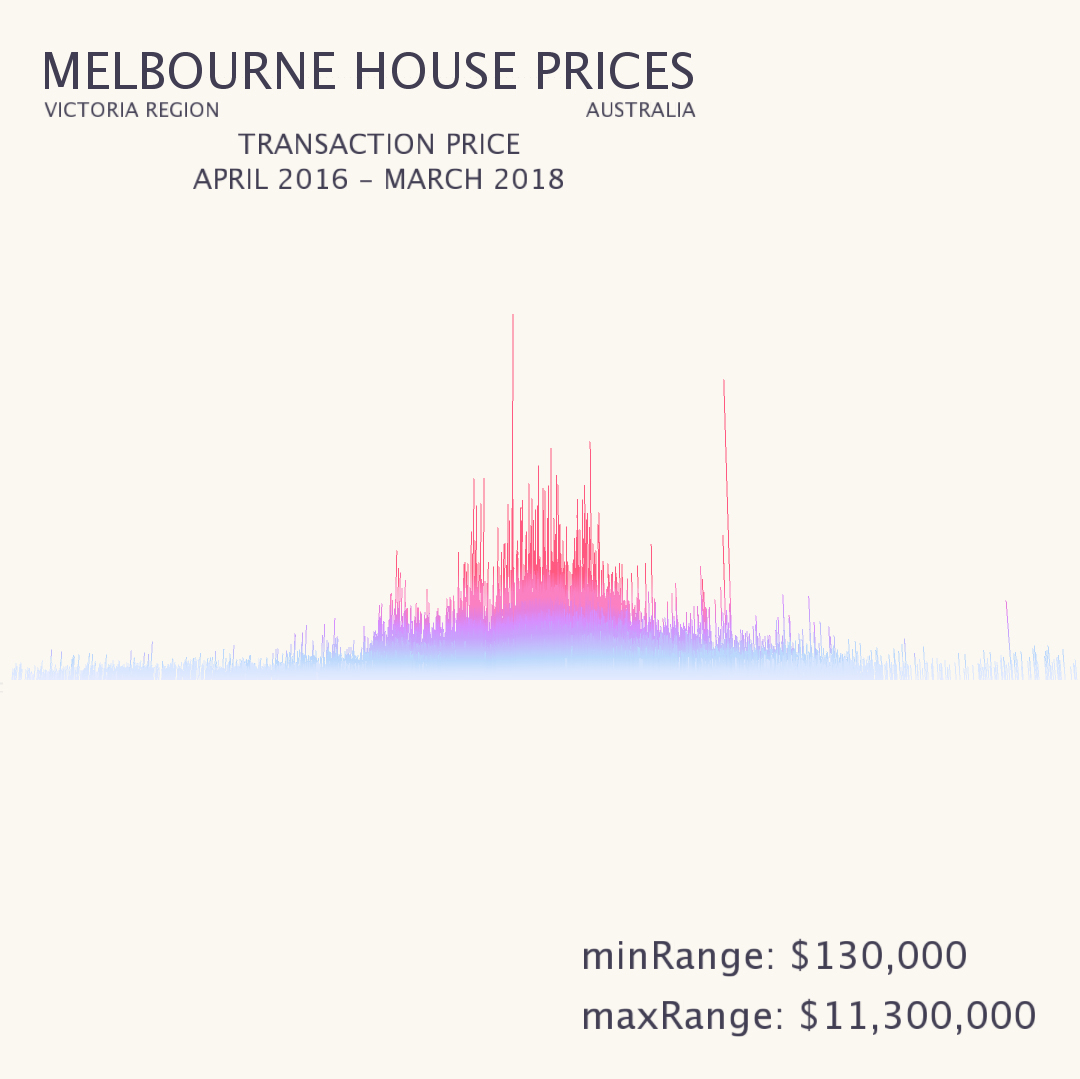
Detailed Bar Chart
This is a bar chart version of the data visualisation. Each line represents the price of a single house. The map can be zoomed in and out or rotated for observation from different perspectives. The graphics will change along with price range changes according to the user’s choice.

