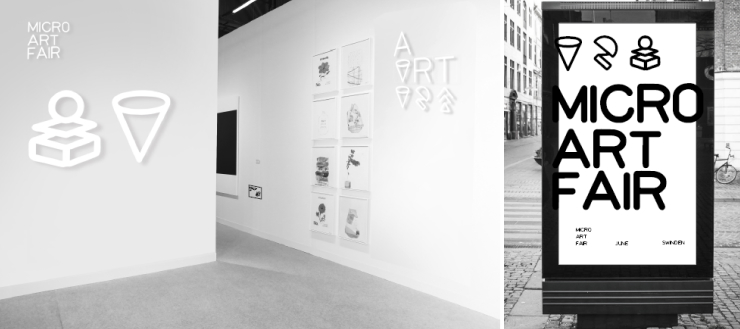
The Micro Art Fair is a branding project for a contemporary playful art fair about developing and promoting visual arts. Our challenge was to create a brand identity that tied artistic language and playful spirit together, so its presence as a modern artistic playground would be recognized by the public.

typeface design, brand identity,
motion graphic
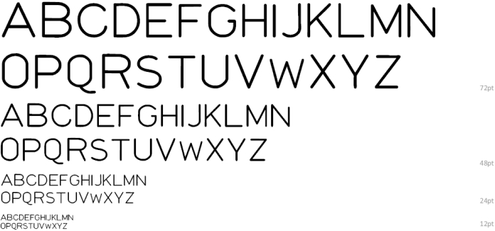
Laser Typeface
Design Concept
Laser Typeface
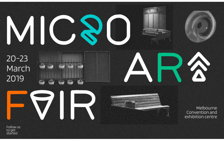
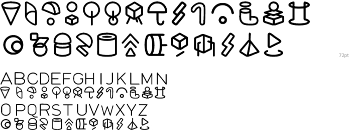
The Laser Typeface design for the Micro Art Fair consisted of two parts: a letter and a symbol. Each upper letter had a unique related symbol. These childish and colorful letters were freely interchangeable in order to create a feeling of freedom and playfulness.
Laser Symbol Typeface
The futuristic graphic elements of the childish symbols portray the playful nature of the art fair.
Exhibition Poster
Typeface in Use
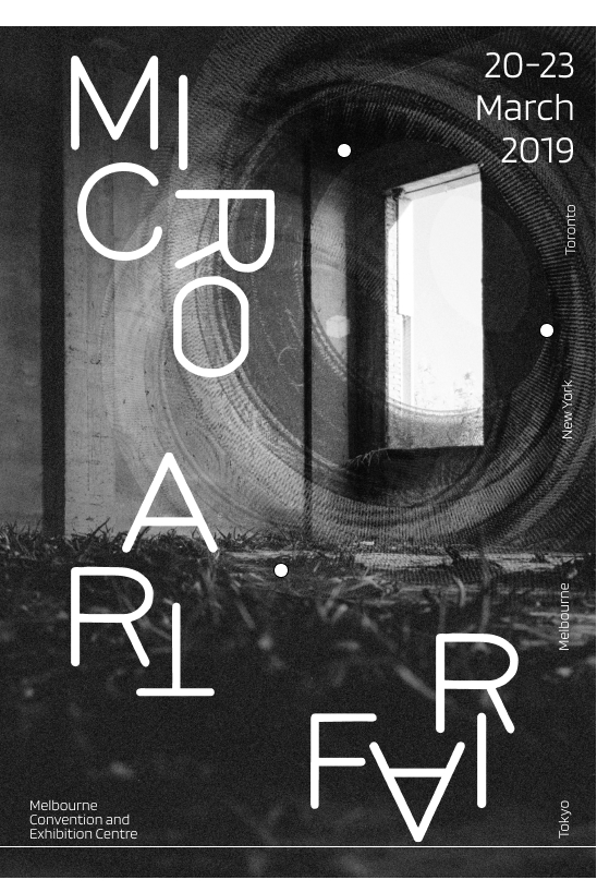
The backgrounds of posters are composed from medium format films that we shot in an abandoned factory.
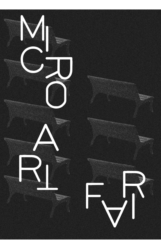
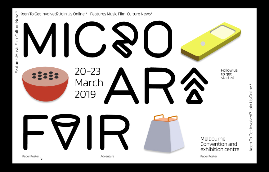
Verson II
This is an illustrated version of the branding. The starting point was to have pictorial elements that would be compatible with the style of typography and create a light-hearted feeling. This led us to add colorful illustrations that were inspired by the industrial design displayed at the exhibition.
Application
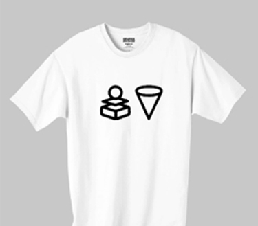
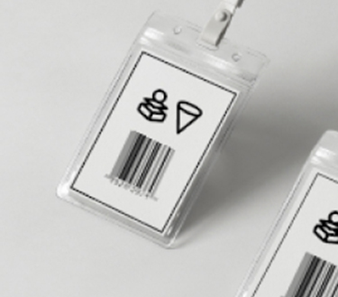
The interchangeable typography can be applied to all aspects of the branding.
